Recently in design Category
As a college professor, I work with mostly junior and senior communication students who are interested in public relations, marketing and media production. Many are in the process of migrating their work online, whether it's for a portfolio or a client-based project.

I see a clear trend among the students. Even a year ago, there was intense interest in learning to hard-code web sites using Dreamweaver or a similar tool. Today, that doesn't happen. The students have learned and seen the value of using a content management system, or CMS. Most use WordPress, but there is a smattering on Blogger, Tumblr, TypePad or Movable Type. Some have skills with Drupal or Joomla.

All of these platforms have robust third-party support, whether its themes, plug-ins, widgets or community sites that answer technical questions. Most are free, and most allow you to host the content yourself if you want to.
It seems like WordPress is dominant, but a recent study of top blogs shows a plurality of leaders.
The key point - find a CMS that you can live with, one that does 90 percent of what you want and need to do. Apply a theme, and then focus on what you do best: the content. Later on, when you want to re-skin the site, or reformat it for delivery to iPhones, or push it to your Facebook or LinkedIn account, you'll be glad you did.
There will always be a place for hard-coded sites, but once you've seen the advantages of a good CMS, you'll never go back.
This morning I spoke to high school students attending portfolio day at Friends University. I suggested to the students that, while a physical portfolio is essential, an online portfolio can be a useful way to leverage the work and help develop an online reputation. Useful when someone needs to see your portfolio right now, or when your portfolio needs to be in two places at once. Saves on postage, too.
An online portfolio tacitly shows that you're comfortable working in an online, digital environment. So start scanning, digitizing, photographing and writing, and get that work online.
Using the SaaS approach (Software as a Service), you don't have to write a bunch of code to create an online portfolio. Host it from a click 'n build website or a blogging platform. Then link, link, link! Photos? Link to Flickr. Video? Link to Vimeo. Powerpoints? Try Slideshare.
Here are some of the other tools I talked about:
Behance.net, currently open by invitation, offers a well-designed online portfolio space. Currently in beta.
Etsy.com, online marketplace for selling handmade things.
Issuu.com, tool for presenting and sharing formatted printed documents online.
VisualCV.com, currently in beta, allows you to create an interactive, online CV and post it in a searchable database.
DeviantArt.com, suggested by a student. International art community that allows you to upload your art, view art by category and participate in social activities.
Last week, my colleague Bobby Rozzell observed that blog design might matter for attracting new readers or occasional readers, but not so much for regular, ongoing readers.
He's right. Most readers first see your blog through an RSS reader. If they do click through, they're likely to see a familiar template from a popular blogging platform like WordPress, Blogspot or Movable Type. Templates are the great democratizers of online design. They make enough design available to all. If you're not a designer, that's a good thing.
And the other reason blog design isn't that important: it's the content, stupid. But you already knew that.
What do you think? Does blog design matter to you?
Here's a nice way to give life to formatted print documents online. Upload your PDF file to Issuu, and it becomes part of a social media sharing site with other print-based documents. The Issuu viewer preserves some of the modalities of print while delivering content online. Great for the online portfolio, for showing proofs to clients, for bringing some zazz to lifeless PDFs. And yes, it's free. The example, above, is One Small Seed, a South African magazine of pop culture.
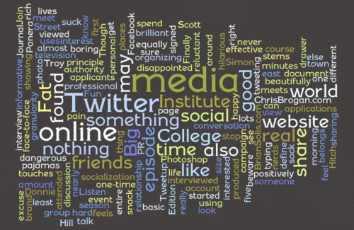
Here's a word cloud created by the fun web site wordle.net. To create your cloud, provide a URL or dump some text into a window. Then you can control type, colors and arrangement. That's five minutes you'll never see again!
Today a federal appeals court ruled that the U.S. government has an obligation to make money more accessible to people who are blind. It's easy for Americans to just assume money has to be a certain way. But we're pretty much alone in the world - out of 180 countries that use paper money - when it comes to making all denominations the same size and color.

As a result, it's near impossible for a person who is blind to know which bill he or she may be spending or receiving as change.
American money is ripe for redoing as an exercise in universal design. Canadian money features a handful of accessibility features, including tactile spots that work like Braille. Different denominations of Euros are different colors, and the bills increase in size as they increase in value. They're nice looking, too.


